Orange: Venn Diagram
Sumber: https://docs.biolab.si//3/visual-programming/widgets/visualize/venndiagram.html
Plot diagram Venn untuk dua atau lebih data subset.
Input
Data: input dataset
Output
Selected Data: instances selected from the plot
Data: entire data with a column indicating whether an instance was selected or not
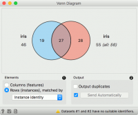
Venn Diagram widget menampilkan hubungan logis antara data set dengan menunjukkan jumlah instance common data (baris) atau jumlah shared featured (kolom). Memilih bagian dari visualisasi akan menghasilkan instance atau feature yang sesuai.
- Select whether to count common features or instances.
- Select whether to include duplicates or to output only unique rows (applicable only when matching by instances).
- If Auto commit is on, changes are automatically communicated to other widgets.
Baris dapat dicocokkan dengan identitas mereka, mis. baris dari data set yang berbeda cocok jika mereka berasal dari baris yang sama dalam file. Daripada menggunakan identitas, kita dapat memilih variabel string yang cocok dengan baris. Peringatan ditampilkan jika kumpulan data tidak memiliki variabel string yang sama.
Contoh
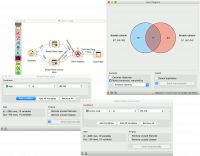
The easiest way to use the Venn Diagram is to select data subsets and find matching instances in the visualization. We use the breast-cancer dataset to select two subsets with Select Rows widget - the first subset is that of breast cancer patients aged between 40 and 49 and the second is that of patients with a tumor size between 20 and 29. The Venn Diagram helps us find instances that correspond to both criteria, which can be found in the intersection of the two circles.
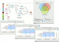
The Venn Diagram widget can be also used for exploring different prediction models. In the following example, we analysed 3 prediction methods, namely Naive Bayes, SVM and Random Forest, according to their misclassified instances.
By selecting misclassifications in the three Confusion Matrix widgets and sending them to Venn diagram, we can see all the misclassification instances visualized per method used. Then we open Venn Diagram and select, for example, the misclassified instances that were identified by all three methods. This is represented as an intersection of all three circles. Click on the intersection to see this two instances marked in the Scatter Plot widget. Try selecting different diagram sections to see how the scatter plot visualization changes.


