Data Science: Visualisasi
Jump to navigation
Jump to search
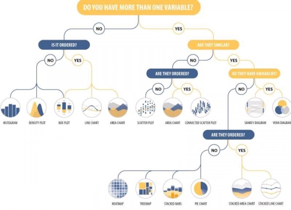
The figure is a decision tree for choosing the appropriate data visualization based on the number of variables and their characteristics. It helps in selecting the right type of chart or graph depending on whether the data is single-variable (univariate) or multi-variable (bivariate or multivariate).
Step 1: Do You Have More Than One Variable?
If NO (Single Variable Data)
- Is the data ordered?
- No: Use a Histogram or Density Plot for distribution.
- Yes: Use a Box Plot, Line Chart, or Area Chart for trends.
If YES (More Than One Variable)
- Are the variables similar?
- No: Check if they are ordered.
- Not Ordered: Use a Scatter Plot.
- Ordered: Use an Area Chart or Connected Scatter Plot.
- No: Check if they are ordered.
- Yes: Check if they have a hierarchy.
- Hierarchy Exists: Use a Sankey Diagram or Venn Diagram.
- No Hierarchy: Check if the data is ordered.
- Not Ordered: Use a Heatmap or Treemap.
- Ordered: Use Stacked Bars, Pie Chart, Stacked Area Chart, or Stacked Line Chart.
Purpose of the Figure
This visualization decision tree simplifies the process of choosing the right type of chart based on data characteristics. It ensures that visual representations align with the structure of the dataset, making insights easier to understand.
