Difference between revisions of "Orange: t-SNE"
Onnowpurbo (talk | contribs) (Created page with "Sumber: https://docs.biolab.si//3/visual-programming/widgets/unsupervised/tsne.html Two-dimensional data projection with t-SNE. Inputs Data: input dataset Data Sub...") |
Onnowpurbo (talk | contribs) |
||
| Line 6: | Line 6: | ||
Data: input dataset | Data: input dataset | ||
| − | |||
Data Subset: subset of instances | Data Subset: subset of instances | ||
| Line 12: | Line 11: | ||
Selected Data: instances selected from the plot | Selected Data: instances selected from the plot | ||
| − | |||
Data: data with an additional column showing whether a point is selected | Data: data with an additional column showing whether a point is selected | ||
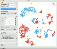
The t-SNE widget plots the data with a t-distributed stochastic neighbor embedding method. t-SNE is a dimensionality reduction technique, similar to MDS, where points are mapped to 2-D space by their probability distribution. | The t-SNE widget plots the data with a t-distributed stochastic neighbor embedding method. t-SNE is a dimensionality reduction technique, similar to MDS, where points are mapped to 2-D space by their probability distribution. | ||
| − | + | [[File:TSNE-stamped.png|center|200px|thumb]] | |
Number of iterations for optimization and the measure of perplexity. Press Start to (re-)run the optimization. | Number of iterations for optimization and the measure of perplexity. Press Start to (re-)run the optimization. | ||
| − | |||
Select the number of PCA components used for projection. | Select the number of PCA components used for projection. | ||
| − | |||
Set the color of the displayed points (you will get colors for discrete values and grey-scale points for continuous). Set shape, size and label to differentiate between points. Set symbol size and opacity for all data points. Set jittering to randomly disperse data points. | Set the color of the displayed points (you will get colors for discrete values and grey-scale points for continuous). Set shape, size and label to differentiate between points. Set symbol size and opacity for all data points. Set jittering to randomly disperse data points. | ||
| − | |||
Adjust plot properties: | Adjust plot properties: | ||
| − | |||
Show legend displays a legend on the right. Click and drag the legend to move it. | Show legend displays a legend on the right. Click and drag the legend to move it. | ||
| − | |||
Show all data on mouse hover enables information bubbles if the cursor is placed on a dot. | Show all data on mouse hover enables information bubbles if the cursor is placed on a dot. | ||
| − | |||
Show class density colors the graph by class. | Show class density colors the graph by class. | ||
| − | |||
Label only selected points allows you to select individual data instances and label them. | Label only selected points allows you to select individual data instances and label them. | ||
| − | |||
If Send selected automatically is ticked, changes are communicated automatically. Alternatively, press Send Selected. | If Send selected automatically is ticked, changes are communicated automatically. Alternatively, press Send Selected. | ||
| − | |||
Select, zoom, pan and zoom to fit are the options for exploring the graph. The manual selection of data instances works as an angular/square selection tool. Double click to move the projection. Scroll in or out for zoom. | Select, zoom, pan and zoom to fit are the options for exploring the graph. The manual selection of data instances works as an angular/square selection tool. Double click to move the projection. Scroll in or out for zoom. | ||
| − | |||
Access help, save image or produce a report. | Access help, save image or produce a report. | ||
| − | + | ==Contoh== | |
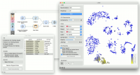
We will use Single Cell Datasets widget to load Bone marrow mononuclear cells with AML (sample) data. Then we will pass it through k-Means and select 2 clusters from Silhouette Scores. Ok, it looks like there might be two distinct clusters here. | We will use Single Cell Datasets widget to load Bone marrow mononuclear cells with AML (sample) data. Then we will pass it through k-Means and select 2 clusters from Silhouette Scores. Ok, it looks like there might be two distinct clusters here. | ||
| Line 51: | Line 39: | ||
In t-SNE, use Scores attribute to color the points and set their size. We see that killer cells are nicely clustered together and that t-SNE indeed found subpopulations. | In t-SNE, use Scores attribute to color the points and set their size. We see that killer cells are nicely clustered together and that t-SNE indeed found subpopulations. | ||
| − | + | [[File:TSNE-Example.png|center|200px|thumb]] | |
Revision as of 09:17, 24 January 2020
Sumber: https://docs.biolab.si//3/visual-programming/widgets/unsupervised/tsne.html
Two-dimensional data projection with t-SNE.
Inputs
   Data: input dataset
   Data Subset: subset of instances
Outputs
   Selected Data: instances selected from the plot
   Data: data with an additional column showing whether a point is selected
The t-SNE widget plots the data with a t-distributed stochastic neighbor embedding method. t-SNE is a dimensionality reduction technique, similar to MDS, where points are mapped to 2-D space by their probability distribution.
   Number of iterations for optimization and the measure of perplexity. Press Start to (re-)run the optimization.
   Select the number of PCA components used for projection.
   Set the color of the displayed points (you will get colors for discrete values and grey-scale points for continuous). Set shape, size and label to differentiate between points. Set symbol size and opacity for all data points. Set jittering to randomly disperse data points.
   Adjust plot properties:
       Show legend displays a legend on the right. Click and drag the legend to move it.
       Show all data on mouse hover enables information bubbles if the cursor is placed on a dot.
       Show class density colors the graph by class.
       Label only selected points allows you to select individual data instances and label them.
   If Send selected automatically is ticked, changes are communicated automatically. Alternatively, press Send Selected.
   Select, zoom, pan and zoom to fit are the options for exploring the graph. The manual selection of data instances works as an angular/square selection tool. Double click to move the projection. Scroll in or out for zoom.
   Access help, save image or produce a report.
Contoh
We will use Single Cell Datasets widget to load Bone marrow mononuclear cells with AML (sample) data. Then we will pass it through k-Means and select 2 clusters from Silhouette Scores. Ok, it looks like there might be two distinct clusters here.
But can we find subpopulations in these cells? Let us load Bone marrow mononuclear cells with AML (markers) with Single Cell Datasets. Now, pass the marker genes to Data Table and select, for example, natural killer cells from the list (NKG7).
Pass the markers and k-Means results to Score Cells widget and select geneName to match markers with genes. Finally, add t-SNE to visualize the results.
In t-SNE, use Scores attribute to color the points and set their size. We see that killer cells are nicely clustered together and that t-SNE indeed found subpopulations.

