Difference between revisions of "Orange: Line Chart"
Jump to navigation
Jump to search
Onnowpurbo (talk | contribs) |
Onnowpurbo (talk | contribs) (→Contoh) |
||
| (5 intermediate revisions by the same user not shown) | |||
| Line 1: | Line 1: | ||
Sumber: https://orange.biolab.si/widget-catalog/time-series/line_chart/ | Sumber: https://orange.biolab.si/widget-catalog/time-series/line_chart/ | ||
| + | Widget Line Chart dapat mem-visualisasikan time series’ sequence dan pergerakannya dalam visualisasi time series paling mendasar yang cukup mudah untuk dibayangkan. | ||
| − | |||
| − | + | ==Input== | |
| − | + | Time series: Time series as output by As Timeseries widget. | |
| − | + | Forecast: Time series forecast as output by one of the models (like VAR or ARIMA). | |
| − | + | Menggunakan widget Line Chart kita dapat mem-visualisasi-kan time series. | |
[[File:Line-chart-stamped.png|center|200px|thumb]] | [[File:Line-chart-stamped.png|center|200px|thumb]] | ||
| − | + | * Stack a new line chart below the current charts. | |
| − | + | * Remove the associated stacked chart. | |
| − | + | * Type of chart to draw. Options are: line, step line, column, area, spline. | |
| − | + | * Switch between linear and logarithmic y axis. | |
| − | + | * Select the time series to preview (select multiple series using the Ctrl key). | |
| − | + | * See the selected series in this area. | |
==Contoh== | ==Contoh== | ||
| − | + | Pada widget Line Chart, kita dapat memasukan forecast input signal dari hasil model forecast. Prakiraan digambar dengan garis putus-putus dan interval kepercayaan (confidence) sebagai area jangkauan. | |
[[File:Line-chart-ex1.png|center|200px|thumb]] | [[File:Line-chart-ex1.png|center|200px|thumb]] | ||
| − | |||
==Referensi== | ==Referensi== | ||
Latest revision as of 10:36, 17 March 2020
Sumber: https://orange.biolab.si/widget-catalog/time-series/line_chart/
Widget Line Chart dapat mem-visualisasikan time series’ sequence dan pergerakannya dalam visualisasi time series paling mendasar yang cukup mudah untuk dibayangkan.
Input
Time series: Time series as output by As Timeseries widget.
Forecast: Time series forecast as output by one of the models (like VAR or ARIMA).
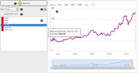
Menggunakan widget Line Chart kita dapat mem-visualisasi-kan time series.
- Stack a new line chart below the current charts.
- Remove the associated stacked chart.
- Type of chart to draw. Options are: line, step line, column, area, spline.
- Switch between linear and logarithmic y axis.
- Select the time series to preview (select multiple series using the Ctrl key).
- See the selected series in this area.
Contoh
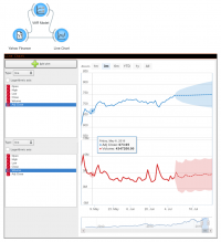
Pada widget Line Chart, kita dapat memasukan forecast input signal dari hasil model forecast. Prakiraan digambar dengan garis putus-putus dan interval kepercayaan (confidence) sebagai area jangkauan.

