Difference between revisions of "Orange: Distributions"
Onnowpurbo (talk | contribs) (Created page with "Sumber: https://docs.biolab.si//3/visual-programming/widgets/visualize/distributions.html Displays value distributions for a single attribute. Inputs Data: input datas...") |
Onnowpurbo (talk | contribs) |
||
| Line 12: | Line 12: | ||
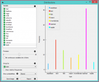
For discrete attributes, the graph displayed by the widget shows how many times (e.g., in how many instances) each attribute value appears in the data. If the data contains a class variable, class distributions for each of the attribute values will be displayed as well (like in the snapshot below). In order to create this graph, we used the Zoo dataset. | For discrete attributes, the graph displayed by the widget shows how many times (e.g., in how many instances) each attribute value appears in the data. If the data contains a class variable, class distributions for each of the attribute values will be displayed as well (like in the snapshot below). In order to create this graph, we used the Zoo dataset. | ||
| − | + | [[File:Distributions-Disc-stamped.png|center|200px|thumb]] | |
A list of variables for distributions display | A list of variables for distributions display | ||
| Line 21: | Line 21: | ||
Show probabilities. | Show probabilities. | ||
| − | |||
Save image saves the graph to your computer in a .svg or .png format. | Save image saves the graph to your computer in a .svg or .png format. | ||
| − | |||
Produce a report. | Produce a report. | ||
| Line 30: | Line 28: | ||
For the purpose of this example, we used the Iris dataset. | For the purpose of this example, we used the Iris dataset. | ||
| − | + | [[File:Distributions-Cont.png|center|200px|thumb]] | |
In class-less domains, the bars are displayed in gray. Here we set Bin continuous variables into 10 bins, which distributes variables into 10 intervals and displays averages of these intervals as histograms (see 2. above). We used the Housing dataset. | In class-less domains, the bars are displayed in gray. Here we set Bin continuous variables into 10 bins, which distributes variables into 10 intervals and displays averages of these intervals as histograms (see 2. above). We used the Housing dataset. | ||
| − | + | [[File:Distributions-NoClass.png|center|200px|thumb]] | |
Revision as of 10:32, 22 January 2020
Sumber: https://docs.biolab.si//3/visual-programming/widgets/visualize/distributions.html
Displays value distributions for a single attribute.
Inputs
Data: input dataset
The Distributions widget displays the value distribution of discrete or continuous attributes. If the data contains a class variable, distributions may be conditioned on the class.
For discrete attributes, the graph displayed by the widget shows how many times (e.g., in how many instances) each attribute value appears in the data. If the data contains a class variable, class distributions for each of the attribute values will be displayed as well (like in the snapshot below). In order to create this graph, we used the Zoo dataset.
A list of variables for distributions display
If Bin continuous variables is ticked, the widget will discretize continuous variables by assigning them to intervals. The number of intervals is set by precision scale. Alternatively, you can set smoothness for the distribution curves of continuous variables.
The widget may be requested to display value distributions only for instances of certain class (Group by). Show relative frequencies will scale the data by percentage of the dataset.
   Show probabilities.
   Save image saves the graph to your computer in a .svg or .png format.
   Produce a report.
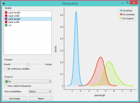
For continuous attributes, the attribute values are displayed as a function graph. Class probabilities for continuous attributes are obtained with Gaussian kernel density estimation, while the appearance of the curve is set with the Precision bar (smooth or precise).
For the purpose of this example, we used the Iris dataset.
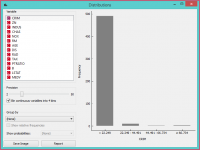
In class-less domains, the bars are displayed in gray. Here we set Bin continuous variables into 10 bins, which distributes variables into 10 intervals and displays averages of these intervals as histograms (see 2. above). We used the Housing dataset.


