Orange: Correlogram
Revision as of 06:23, 30 January 2020 by Onnowpurbo (talk | contribs)
Sumber: https://orange.biolab.si/widget-catalog/time-series/correlogram/
Visualize variables’ auto-correlation.
Input
Time series: Time series as output by As Timeseries widget.
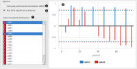
In this widget, you can visualize the autocorrelation coefficients for the selected time series.
- Select the series to calculate autocorrelation for.
- See the autocorrelation coefficients.
- Choose to calculate the coefficients using partial autocorrelation function (PACF) instead.
- Choose to plot the 95% significance interval (dotted horizontal line). Coefficients that are outside of this interval might be significant.
See also
Periodogram
