Orange: Line Chart
Revision as of 06:23, 30 January 2020 by Onnowpurbo (talk | contribs)
Sumber: https://orange.biolab.si/widget-catalog/time-series/line_chart/
Visualize time series’ sequence and progression in the most basic time series visualization imaginable.
Input
Time series: Time series as output by As Timeseries widget.
Forecast: Time series forecast as output by one of the models (like VAR or ARIMA).
You can visualize the time series in this widget.
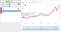
- Stack a new line chart below the current charts.
- Remove the associated stacked chart.
- Type of chart to draw. Options are: line, step line, column, area, spline.
- Switch between linear and logarithmic y axis.
- Select the time series to preview (select multiple series using the Ctrl key).
- See the selected series in this area.
Contoh
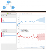
Attach the model’s forecast to the Forecast input signal to preview it. The forecast is drawn with a dotted line and the confidence intervals as an ranged area.

