Orange: Lift Curve
Sumber: https://docs.biolab.si//3/visual-programming/widgets/evaluate/liftcurve.html
Measures the performance of a chosen classifier against a random classifier.
Inputs
Evaluation Results: results of testing classification algorithms
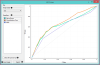
The Lift curve shows the relation between the number of instances which were predicted positive and those that are indeed positive and thus measures the performance of a chosen classifier against a random classifier. The graph is constructed with the cumulative number of cases (in descending order of probability) on the x-axis and the cumulative number of true positives on the y-axis. Lift curve is often used in segmenting the population, e.g., plotting the number of responding customers against the number of all customers contacted. You can also determine the optimal classifier and its threshold from the graph.
   Choose the desired Target class. The default class is chosen alphabetically.
   If test results contain more than one classifier, the user can choose which curves she or he wants to see plotted. Click on a classifier to select or deselect the curve.
   Show lift convex hull plots a convex hull over lift curves for all classifiers (yellow curve). The curve shows the optimal classifier (or combination thereof) for each desired TP/P rate.
   Press Save Image if you want to save the created image to your computer in a .svg or .png format.
   Produce a report.
   2-D pane with P rate (population) as x-axis and TP rate (true positives) as a y-axis. The diagonal line represents the behavior of a random classifier. Click and drag to move the pane and scroll in or out to zoom. Click on the “A” sign at the bottom left corner to realign the pane.
Note! The perfect classifier would have a steep slope towards 1 until all classes are guessed correctly and then run straight along 1 on y-axis to (1,1).
Contoh
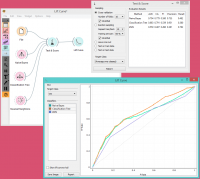
At the moment, the only widget which gives the right type of the signal needed by the Lift Curve is Test & Score.
In the example below, we try to see the prediction quality for the class ‘survived’ on the Titanic dataset. We compared three different classifiers in the Test Learners widget and sent them to Lift Curve to see their performance against a random model. We see the Tree classifier is the best out of the three, since it best aligns with lift convex hull. We also see that its performance is the best for the first 30% of the population (in order of descending probability), which we can set as the threshold for optimal classification.
Referensi
Handouts of the University of Notre Dame on Data Mining - Lift Curve. Available here.
Referensi

