Orange: Line Chart
Revision as of 07:23, 26 January 2020 by Onnowpurbo (talk | contribs)
Sumber: https://orange.biolab.si/widget-catalog/time-series/line_chart/
Visualize time series’ sequence and progression in the most basic time series visualization imaginable.
Inputs
   Time series: Time series as output by As Timeseries widget.
   Forecast: Time series forecast as output by one of the models (like VAR or ARIMA).
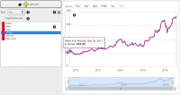
You can visualize the time series in this widget.
   Stack a new line chart below the current charts.
   Remove the associated stacked chart.
   Type of chart to draw. Options are: line, step line, column, area, spline.
   Switch between linear and logarithmic y axis.
   Select the time series to preview (select multiple series using the Ctrl key).
   See the selected series in this area.
Contoh
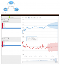
Attach the model’s forecast to the Forecast input signal to preview it. The forecast is drawn with a dotted line and the confidence intervals as an ranged area.

