Difference between revisions of "Orange: Linear Projection"
Onnowpurbo (talk | contribs) |
Onnowpurbo (talk | contribs) |
||
| Line 1: | Line 1: | ||
Sumber: https://docs.biolab.si//3/visual-programming/widgets/visualize/linearprojection.html | Sumber: https://docs.biolab.si//3/visual-programming/widgets/visualize/linearprojection.html | ||
| − | |||
A linear projection method with explorative data analysis. | A linear projection method with explorative data analysis. | ||
| − | + | ==Input== | |
| − | + | Data: input dataset | |
| − | + | Data Subset: subset of instances | |
| − | + | Projection: custom projection vectors | |
| − | + | ==Output== | |
| − | + | Selected Data: instances selected from the plot | |
| − | + | Data: data with an additional column showing whether a point is selected | |
| − | + | Components: projection vectors | |
This widget displays linear projections of class-labeled data. It supports various types of projections such as circular, linear discriminant analysis, principal component analysis, and custom projection. | This widget displays linear projections of class-labeled data. It supports various types of projections such as circular, linear discriminant analysis, principal component analysis, and custom projection. | ||
| Line 23: | Line 22: | ||
[[File:Linear-projection-stamped.png|center|200px|thumb]] | [[File:Linear-projection-stamped.png|center|200px|thumb]] | ||
| − | + | * Axes in the projection that are displayed and other available axes. | |
| − | + | * Optimize your projection by using Suggest Features. This feature scores attributes by average classification accuracy and returns the top scoring attributes with a simultaneous visualization update. | |
| − | + | * Choose the type of projection. | |
| − | + | * Axes inside a circle are hidden. Circle radius can be be changed using a slider. | |
| − | + | * Adjust plot properties: | |
| − | + | ||
| − | + | ** Set jittering to prevent the dots from overlapping (especially for discrete attributes). | |
| − | + | ** Show legend displays a legend on the right. Click and drag the legend to move it. | |
| − | + | ** Show class density colors the graph by class (see the screenshot below). | |
| − | + | ** Label only selected points allows you to select individual data instances and label them. | |
| − | + | ||
| − | + | * Select, zoom, pan and zoom to fit are the options for exploring the graph. Manual selection of data instances works as an angular/square selection tool. Double click to move the projection. Scroll in or out for zoom. | |
| + | * If Send automatically is ticked, changes are communicated automatically. Alternatively, press Send. | ||
| + | * Save Image saves the created image to your computer in a .svg or .png format. Produce a report. | ||
==Contoh== | ==Contoh== | ||
Revision as of 08:57, 28 January 2020
Sumber: https://docs.biolab.si//3/visual-programming/widgets/visualize/linearprojection.html
A linear projection method with explorative data analysis.
Input
Data: input dataset
Data Subset: subset of instances
Projection: custom projection vectors
Output
Selected Data: instances selected from the plot
Data: data with an additional column showing whether a point is selected
Components: projection vectors
This widget displays linear projections of class-labeled data. It supports various types of projections such as circular, linear discriminant analysis, principal component analysis, and custom projection.
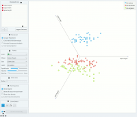
Consider, for a start, a projection of the Iris dataset shown below. Notice that it is the sepal width and sepal length that already separate Iris setosa from the other two, while the petal length is the attribute best separating Iris versicolor from Iris virginica.
- Axes in the projection that are displayed and other available axes.
- Optimize your projection by using Suggest Features. This feature scores attributes by average classification accuracy and returns the top scoring attributes with a simultaneous visualization update.
- Choose the type of projection.
- Axes inside a circle are hidden. Circle radius can be be changed using a slider.
- Adjust plot properties:
- Set jittering to prevent the dots from overlapping (especially for discrete attributes).
- Show legend displays a legend on the right. Click and drag the legend to move it.
- Show class density colors the graph by class (see the screenshot below).
- Label only selected points allows you to select individual data instances and label them.
- Select, zoom, pan and zoom to fit are the options for exploring the graph. Manual selection of data instances works as an angular/square selection tool. Double click to move the projection. Scroll in or out for zoom.
- If Send automatically is ticked, changes are communicated automatically. Alternatively, press Send.
- Save Image saves the created image to your computer in a .svg or .png format. Produce a report.
Contoh
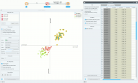
The Linear Projection widget works just like other visualization widgets. Below, we connected it to the File widget to see the set projected on a 2-D plane. Then we selected the data for further analysis and connected it to the Data Table widget to see the details of the selected subset.
Referensi
Koren Y., Carmel L. (2003). Visualization of labeled data using linear transformations. In Proceedings of IEEE Information Visualization 2003, (InfoVis’03). Available here.
Boulesteix A.-L., Strimmer K. (2006). Partial least squares: a versatile tool for the analysis of high-dimensional genomic data. Briefings in Bioinformatics, 8(1), 32-44. Abstract here.

